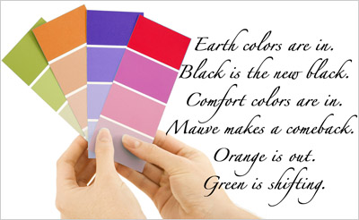
Most consumers demand novelty. The marketing mantra, "Today’s sensation is tomorrow’s blank stare," sums up the ebb and flow of color trends. Hot new colors have become a big business - one that many question. Nevertheless, whether it’s the "in color" for next year or the emerging color for the next decade, new colors are going to get the consumer to pay attention and to pay a good price as well.
We need to remember that several important factors affect the selection and application of any "new" color in advertising (or any other visual communications medium, for that matter): The product or service, the target audience, and the communications medium itself. Steely blues may seduce in a Cartier ad in Town & Country - or an Hummer TV spot. A pungent orange in a Banana Republic ad may jolt in Vogue Magazine. Still lurking in the shadows are the bittersweet temptations of avocado green - a color that H&R Block has embraced.
When "cutting edge" colors are applied to the actual product, we’ll find that the life expectancy of the object plays a significant role. Most of us may impulsively buy a lime green t-shirt, yet decide not to invest in the new Volkswagen beetle in any such trendy shade. What may be a runaway success in fashion may not apply to cars or interior furnishings.
Now that the Internet has become a significant medium for advertising, "trendy" colors are even more problematic on a global level. A good case in point is the emergence of purple in the States during the 80s. By the end of that decade and through the early 90s, the color has made its way into virtually all industries, from music ("Purple rain" by the artist then known as Prince) to filmmaking ("The color purple") and fashion, not to mention visual arts. Even the car makers have joined the parade, with purple being one of the colors of macho trucks manufactured by Ford around 1995. Yet, certain shades of purple have always been powerfully aligned with death and morbidity in Catholic Europe. Although in recent years, some of these negative connotations have been shed, and the color has slowly gained new associations with fun and cheerfulness in American culture, thousand-year-old traditions of other countries are not easy to overcome.
All things considered, color trends are a complex issue, one which is not easily defined by simple color predictions. Efforts to pinpoint the "magic" color or color family usually rely upon other lifestyle influences, such as television, films, music, magazines, social issues, contemporary events, and a multitude of other sources. Now that the Web has exponentially increased this visual bombardment, we see more images and colors than ever before. It’s likely that this trend is going to continue at a rapid pace.
Note: The following was written in 2000. Although some of the information is dated, it does provide some significant insights about color trends - and especially so as we look back in time.
Amidst this present frenzy, it would be wise to cautiously review the history of recent color trends in the hopes of finding some clues for our present quest. For one, America’s fascination with green during the early 90s gave birth to the popularity of yellow-green in the middle of the decade. For the past 10 years, avocado and acidic lime greens have permeated the visual landscape in the US. From magazine ads to websites, shades of yellow-green have been the prescription for an attention-grabbing look. Today, a trip to the Gap or Neiman Marcus easily confirms that these colors are still alive and well in the world of fashion. Is anyone not offering a t-shirt in some shade of yellow-green this year?
Historically, shades of yellow-green first became popular during the "green, gold, and copper" refrigerator days of the 60s and early 70s. Ironically, an avocado refrigerator since became a symbol of a horrendous lapse in what some refer to as "taste." Perhaps it was the flood of appliances and day-glo hippie posters that did it, or maybe it was color trend burn-out, but finding a shirt or bath towel in this color was almost impossible in the 80s. Nevertheless, by 1995, yellow-based greens were infiltrating the visual landscape again. Advances in textiles and dyes made brilliant lime a staple in the fashion industry, thus fulfilling the standard that a color can be reinvented in exciting new ways. Other variations — the resurrected avocado and olive green — were new again, at least in terms of the collective consciousness of a youth-oriented American culture.
That is precisely why orange may very well be moving into the forefront of the color parade. Therefore, one might say that Clue #1 is "The shock of the new." Find a color that hasn’t put in a tour of duty during the past 20 years and/or zap it with a new look, and chances are excellent that it has the potential to succeed as an attention-getting color.
Interestingly, prior to the recent avocado/lime green rage, most people intuitively felt that these were "sickly" colors and avoided them. They were right. In fact, they had been known to induce nausea and were — and remain — banned from aircraft interiors. Any sailor would tell you to avoid shades of yellow green.
As we turned our sights to orange, substantial research (including the data gathered at The Global Color Survey Database and the Pantone Consumer Color Preference Study® (dated June 1996) has documented that orange is one of Americans’ least favorite colors. (It’s interesting to note that orange was always a favorite color in the Netherlands, for the precise reason that the country’s ruling monarchy is the House of Orange.) In 1991, Forbes called attention to orange’s mundane associations in its December 23 article, "Does orange mean cheap?" Yes, it does.
In summary, we are now looking at an unpopular cheap color coming into the forefront of trendy colors. Hence, clue #2 is: "It’s so bad, it’s good."
Psychologically, the "anti-aesthetic" colors may well capture more attention than those on the aesthetically-correct list. History clearly demonstrates that this has been a prevalent trend in art since the turn of the 20th century, when Dada’s urinals and snow shovels put an end to the era of Matisse and French Impressionism.
But what about the rest of the spectrum? There is a substantial mass of humanity who make educated and, more importantly, individual taste judgments about color. That is precisely why we should consider the fact that we are becoming more diversified as we expand our consciousness in this new millennium. The quest for a singular color or emerging colors is something we love to talk about, but few of us practice it in real life.
Yet, there is no question that color will continue to communicate on a subliminal level. A metallic blue Mitsubishi TV spot and an orange Polo ad in Fortune are guaranteed to pack punch. Hold on to your wallets.
About this article: "Quirks of the Color Quest" was published in Visual ArtsTrends magazine. Revised 2011.
About the author: Jill Morton is an internationally-recognized color consultant whose clientele includes industry giants Nokia and Kodak. Publications such as Fortune, Entrepreneur and Metropolis have all sought her editorial commentary about the red-hot “scientific art” of color. Before the arrival of the Internet, Jill served as faculty at the University of Hawaii School of Architecture, Chaminade University, and Matsuda Technology Center. In addition to maintaining an incredible online resource for color information, Color Matters, she is the author of Color Voodoo, a series of books about color theory and symbolism.


