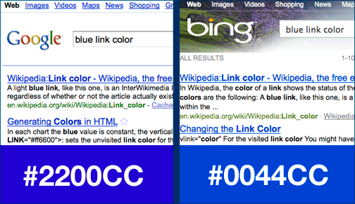
If you've ever wondered if color can make a multi-million dollar difference, check out this example of a special shade of blue.
A Color that’s Worth $80,000,000

A reader asked what shade of green I specified for the bank in the previous blog post. Before I answer that, here’s a story about a multi-million dollar color:
The right shade of blue can be worth $80 million – at least that’s what they say about Bing’s blue link color. Microsoft’s research team found that blue engaged people the most and they tested various shades of blue in user groups. First, they determined that their previous shade of blue (a paler hue) lacked confidence. Finally, they wound up with a shade of blue quite similar to the one used by Google. Based on user feedback, the team estimated the best blue color could generate $80 million to $90 million in ad sales.
By the way, you’ve probably been a guinea pig for Google’s analysis of the click-through rate of different link colors. Gmail’s users were randomly tested with 40 different link colors, ranging from “blue-with-greenish” to “blue-with-blue-ish.” Google discovered that blue-ish links encouraged more clicking than greenish. (Have you noticed that Gmail uses a slightly different shade of blue for its links than the main Google search page?)
My take on this is that HTML links were originally a similar shade of blue – a strong vivid blue with great contrast on a white background. Perhaps we're just hard-wired to click on blue. Is there really such a difference between #0044CC and #2200CC as to have a noticeable effect? What do you think? Also, aside from those blues, which color would make you click more?
This raises a provocative design question: Should the best color for links be a pure design decision made by someone with strong expertise in design, psychology, and human-computer interaction or should it be determined by an (unintentional) vote among users?
Back to the question about the specific shade of green for that bank: It was not a stodgy green, not a stereotypical banker’s green, NOT that overused green that is used for every eco call to action, and not pure RGB green #00FF00. It was a very special green that can’t be revealed due to confidentiality clauses for this project. However, it is worth noting that the logo design included a small color accent and that the new green created the right harmonious relationships. Always remember that colors never exist in isolation. It may be as simple as blue text on a white background, or pure green next to yellow on a dark green background.
In conclusion, do you think that green can be worth as much as that the blue link color? Consider the phenomenal success Heinz EZ Squirt Blastin' Green ketchup. More than 10 million bottles were sold in the first seven months following its introduction. The result: $23 million in sales - the highest sales increase in the brand's history.
But what about a specific shade of green? What if you could trademark “your green” and prevent others from using it? Would that be worth more than a billion dollars? Here’s an answer: BP, one of the world's largest energy companies, was denied a trademark for green. Here's why: Link
From Color Matters

Trustworthy color formulas for logos and branding
An eCourse from Jill Morton, Color Matters author & consultant.


