The Color of the Year 2009
Thursday, January 01, 2009

Although the color czars are dictating the color that a specific color will be "THE COLOR of 2009" (come back to this blog in a few days for details), we suggest a color bailout. Or maybe we should call a moratorium on all trends. The last thing we need as we enter a new year challenged by severe economic and environmental realities is a color that will promote us to consume more. Isn’t that what any trend evokes?
Perhaps we can blame Marie Antoinette. When I was researching the origin of Tiffany’s signature “robin’s egg blue,” I discovered that light turquoise was the color of the "it-girl" of the day - Empress Eugenie, Napoleon III’s wife, who chose this as her signature color because it was color of the woman she most admired - Marie Antoinette. Tiffany thought this would be the perfect color to attract the fashionistas of the day.
The date was 1850.
Human nature (at least in the Western world) craves the injection of the new. We can’t change that but we can change how we respond to trends. Therefore, let’s proclaim that the color of 2009 is YOUR FAVORITE COLOR.
I’ll tell you the truth about color: As a result of over 20 years of research and practice as a color consultant, the color that will calm you, the color that will make you happier and more productive is .... your favorite color.
So celebrate the New Year! Wear that shirt or blouse that in a color that you love. You might even grab a gallon of paint in your favorite color and see what happens after you paint a wall
(.... just one wall, for starters).

Why the Color Czars Dream Up New Hues
The fashion industry, car manufacturers, makers of interior design products (including paint manufacturers), and many other industries all look to color forecasters to see where color trends might be heading.
These forecasting groups predict color trends one or two years ahead and they charge quite a fee for the their reports and color specifications (chips, swatches, etc.). Manufacturers then “interpret” the forecasts for their products and customers.
Is it self-fulfilling prophecy? Is it manipulative?
Consider this: If you own a paint company, you want to sell paint. One way to do that is to make certain colors seem dated and others seem hot. One day you’re in, one day you’re out. Shame on you if you painted your living room the wrong color. On the other hand, consumers may want to update their wardrobes or paint their walls because the renewal feels uplifting.
In conclusion, we suggest that it’s time for common-sense colors. Classic colors. Personal favorite colors. You’re the color guru in 2009.
See: “The lords of color are always dreaming up a new hue”
The "Must Have" Colors for 2009
Wednesday, January 07, 2009

Pantone, one of several authorities on color, has selected “Mimosa” as the color of the year for 2009. If you look to nature for color definitions, a mimosa is a green tree. However, it is also a cocktail consisting of orange juice and wine or champagne. Pantone’s “Mimosa” is an orange-based yellow - a color that was selected to represent hope and optimism. (It’s a bit contradictory because the name invokes a form of self-indulgence that may not the best approach for 2009.)
Another group of color czars, Color Marketing Group (CMG), proclaims that purple is the “must have” color of 2009. Their prediction also includes a wide range of hues (in the following order):
1. Purples
2. Blue (it’s the new green)
3. Cooled-down, grayed-out browns and grays
4. Yellow (wild vivid yellow)
5. Mauve (it’s back)
They also included a range of exotic bright “accent” colors and white as a “business color.” Wait a minute, just when we were told that black is the new black.....?
Here’s where it gets even more confusing. The Color Association of the United States (CAUS) offers a series of color palettes, which include:
1. The Rock Crystals Palette (mineral hues)
2. The Vegetable Garden Palette (28 warm mid-tones hues)
CAUS director, Leslie Harrington commented: “In 2009, expect to see less contrast, less pastel, less saturated color. And if you don't like that, wait till next year. The theme for the color association's 2010 forecast is contrast and contradiction.”
I for one am not going to wait. I’m opting for the colors that I love and already have. More is less, less is more.
Red - Yellow - Blue
Monday, January 12, 2009

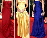
Sometimes color trends begin on the runways of Paris and Milan and later feed their way to us via the proclamations of color groups. If you don't want to wait for the process to work its way through the color chain, you can bypass the process by watching red-carpet events and make up your own mind. With that said, most A-list actresses at the Golden Globes 2009 stuck to basics. As in primary colors. Red, yellow, and blue.

